
15 Great Aerospace Logos
Marty Berman
It’s easy to overstate the importance of a logo.
I could tell you that your logo is the face of your company. Your first impression to potential clients and employees. The visual soul of who you are.
All true, but a bit dramatic. My audience is largely engineers. I know that at the end of the day good technology sells itself.
However, I’ll say this… Your logo, and the branding surrounding it, can take your company to another level. It has the power to spark imagination, excitement, and memories.
With that said, here are 15 killer aerospace logos.
Cessna
This is a gorgeous logo. Bright, bold, friendly, while still very professional.
The plane in negative space is immediately evident and the red and blue play homage to the company’s American heritage.
It’s also versatile. The logo looks great painted on a plane and would make for a solid app icon.
Unfortunately, for the logo at least, Cessna has been acquired a couple of times and the new owners love to slap a bunch of extras on it. A major pet peeve of mine.
Orbex
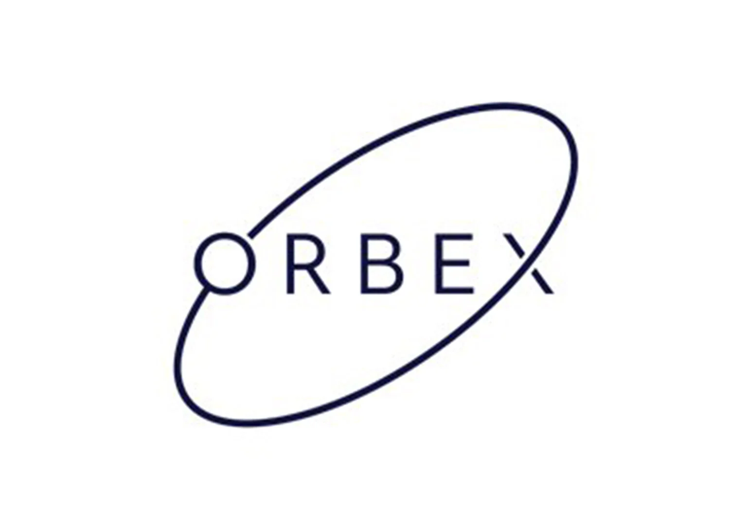
I usually find the orbiting circle around an aerospace logo to be cheesy. And it’s very much over used.
That’s why I was surprised, pleasantly surprised, to like the Orbex logo. They have modernized the swoosh.
It works for two reasons:
The stroke thickness is the same. You don’t see the all too common tapering of the width.
The circle bounds the text. Unlike the SpaceX logo where the X trails off widening the logo significantly, the circle here creates an evenness, a balance.
Hermeus

Hermeus is a startup working to build Mach 5 passenger aircraft. Their logo has several things going for it:
The custom font has movement. It’s italicized and the subtle line through four of the letters reinforces that movement.
The yellow is a refreshing color for the industry. And it’s a color that works great on white or black backgrounds.
The wing can stand on its own as a powerful icon. And this really makes the logo. The wing obviously evokes flight and also nods to the company’s namesake, Hermes.
What really sold me on this logo was seeing it on their Carhartt jackets.

Lufthansa

This is the cleanest airline logo. A thin, elegant icon against a beefy Helvetica-esque font.
I love the crane. It was first designed in 1918, and while it has been modified slightly over the century, the resemblance to the original is unmistakable.

Nano Avionics

This logo’s originality is in its subtlety.
I love the lowercase type and its alignment on the top, rather than the center. The thin “N” makes for a clean but strong icon, and I like how it appears to outline either a satellite bus or circuit board.
It also makes for a simple, slick animation:

Momentus

Here’s a wonderfully refreshing logo for space infrastructure company Momentus. It was designed by Cosma Schema, an agency that specializes in branding for New Space companies.
This logo doesn’t scream space, but that’s OK. Instead it evokes boldness, importance, and the future.
The colors are fun and exciting against the thick black box on top and bolded font below. The logo also works great as a single color. They demonstrate this on their website – when you scroll from a dark section to a light section, the logo adjusts:
NASA (Worm)

The NASA worm logo is simple yet iconic – futuristic yet timeless.
Designed in 1975 by the firm Danne & Blackburn, it was meant to compliment the classic NASA “meatball' logo which was a bit difficult to print and reproduce because of its intricacy. You often saw the NASA “worm” on spacesuits and clothing.

It was retired in 1992 and then brought back in 2020 with the return of American crewed spaceflight when SpaceX launched astronauts Bob Behnken and Doug Hurley to the space station.
I think this logo is wonderful, but it only works because NASA had already built such a strong brand. NASA was a household name and this allowed for the simplification of the logo to just four red letters.
The “worm” could not have existed without the “meatball” first.
NASA (Meatball)
This must be one of the most beloved logos in the world.
You could argue that it’s loved because NASA is loved. That’s part of it, but it’s also a fantastic logo on its own.
Let’s start with the blue circle. Clearly it represents the earth, but it serves another function – adding a boundary to the logo. It contains and balances the other design elements.
Then you have the stars which break up the solid blue and give the logo dimension.
The orbiting white circle is classic aerospace and probably the least important element of the design.
The oversized red chevron on the other hand, is crucial and makes the logo. It does two important things: adds contrast and adds movement. It makes the logo soar.
Boeing

The largest aerospace company has the best aerospace logo.
All of the aerospace clichés are there, but they’re executed to perfection.
Boeing’s logo is among the best in the world – up there with Nike or Coca-Cola.
It’s important to note, the original icon doesn’t belong to Boeing but McDonnell Douglas. When the two companies merged in 1997 they took the Boeing name and the McDonnell Douglas icon. Thankfully though, it got some much needed simplification and refinement.

Boom
Boom’s logo does everything a logo should do – it serves as a visual abstract metaphor (for a sonic boom) and a legible name tag for the company.
The logo is clean and weighted nicely. The type is bold but not too thick and there is a comfortable amount of breathing room between each letter.
I love that the icon is not symmetrical. The varying weights of the lines make it visually interesting and organic. There’s a little bit of an optical illusion that occurs when you view it at different distances but it doesn’t bother me.
Delta

When you look at them one after another, Boom’s logo is pretty similar to Delta’s. I suspect that was on purpose because Delta has the best logo of any airline.
Delta calls their symbol the “widget”. It’s a simple triangle representing an airplane but also of course the fourth letter of the Greek alphabet, delta. It’s a surprisingly brilliant design.
In full color the “widget” has two shades of red giving it a subtle 3D effect.
Normally I avoid putting two colors side-by-side. That’s because every logo should have a single color variant. If your logo relies on having multiple colors, it will look off when one color.
Delta’s logo gets around this issue because of the thin white stroke breaking up the triangle. It’s enough to keep the triangle interesting even in its single color variant.
As for the type, there’s nothing special about it except its legibility.
You may be tempted to call Delta’s logo boring, but I think it’s simply perfect.
Aerospace Corporation

I love this logo for its simplicity and movement. The icon is an “A”, an airplane, a delta, and a protractor all in one.
It’s a logo that looks good now and could look good in a hundred years.
And until someone can prove otherwise, I’m convinced the Avengers got their logo inspiration from the Aerospace Corporation.

PanAm
I had to throw in a vintage logo and why not the crowd pleasing Pan Am logo.
I love when the entirety of a logo can fit in a tidy circle. It makes for a versatile mark that can be put easily into the corner of an official letterhead document or smack dab in the middle of a baseball hat.
While the company has long been defunct, they’re apparently still able to make some cash licensing their brand.
Nanoracks

This logo is five slanted lines. Five beautiful slanted lines.
Let me demonstrate why this is brilliant:
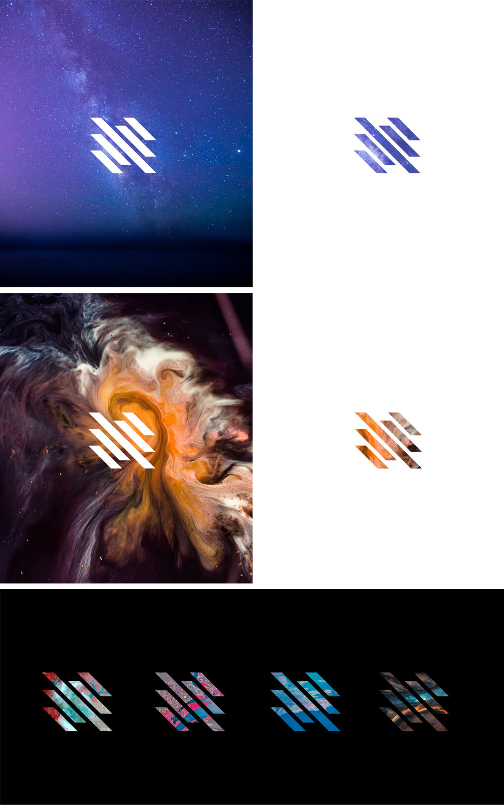
Its simplicity makes it versatile. If the logo had more going on with it, you’d have less freedom to play around with images like these.
Nanorack’s logo is another from Cosma Schema, and it’s another winner.
German Orbital Systems

I’ve always appreciated European coat of arms. They look so fierce, bold, historic, and important.
German Orbital Systems did a wonderful job simplifying the German eagle and accentuating the wings to make a great aerospace logo.
The thin typeface and gold color convey the company as professional and elegant.
Takeaways
By looking at these logos there are several lessons to be learned:
Great aerospace logos should not be complicated. They’re going to be painted on rockets, printed on microchips, and worn by fans on t-shirts. At any one of those sizes your logo should be instantly recognizable and that’s why less is more.
Swooshes and stars are cliché. The benefit to using them is instant recognition as an aerospace company. The downside is conformity.
Have an icon plus a wordmark. The ability to break your icon away from your name gives you flexibility.
The fewer colors the better. This doesn’t just help your printer but also your entire brand. It simplifies the decisions you need to make when you use your brand guidelines on any piece of marketing collateral.
For more content about aerospace content, consider following us on twitter.